Making simple 2D textures from 3D models in Blender

3D games from the mid 90s into the early 2000s usually had extremely basic level geometry in which most environment objects were represented by simple boxes that had most smaller details painted on as part of the flat surface textures. There were no normal maps, bump maps, or displacement maps that would produce dynamic shadows to create the appearance of three dimensional structures in the surfaces. Just some areas being painted in a darker or lighter shade that emulates shadows and highlights. I’ve seen pixel art designers and even some PS1 graphics people paint these shadows and highlights onto the image by hand. But that’s a skill that I think would take quite some time to become good at, and something that would become quite time consuming with all the textures that I want to make for Iridium Moons.

Many people who make tutorials about PS1 textures instead rely on taking photographs of real objects and massively crunching down their resolution and color depth. Which is an approach that I don’t personally like either, as in many games you can quite clearly see that it’s low-quality photos slapped onto boxes. It neither sells the illusion of looking realistic, nor does it work as a stylized look, ending up in a kind of Uncanny Valley situation that just looks bad. I’m also often quite stubborn with getting things to look exactly like I want, and finding the perfect photo references for things in my baroque space fantasy setting could also easily become a massive time sink.

So my solution to making flat 2D textures with believable shadows to create a stylized appearance of depth is to not crunch down photographs of real objects, but instead renders of 3D objects that I can quickly make myself. In this article, I will be going through the entire process that I am using and explain the reason for each step and setting. If you just want to see the specific settings that I am using, they will all be summarized at the end of the page.

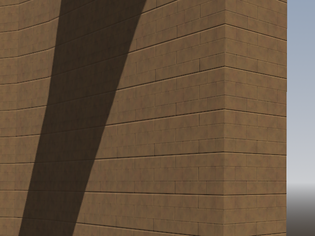
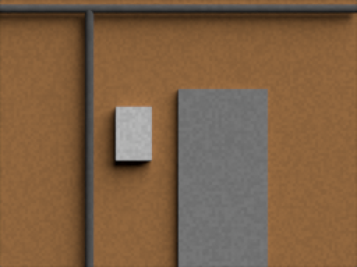
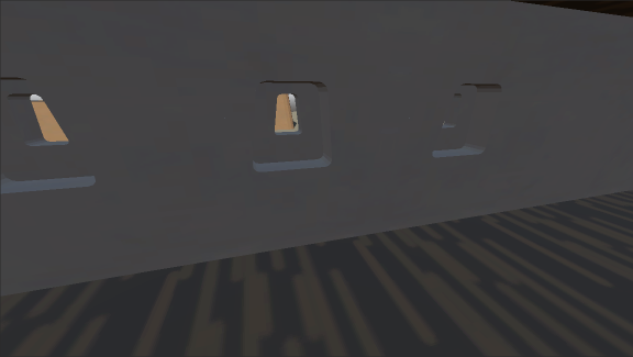
To illustrate the entire process and show how I do it, I quickly made this very simple model of a wall with a doorframe, some kind of electrical box, and two drain pipes. Three cubes and two cylinders whose textures are just one uniform color. This section of wall has a width of 4 meters and a height of 3 meters, which are numbers we are going to need later.

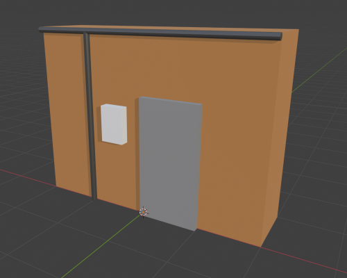
The doorway here is a single solid block without a hole for the door. I recommend not making any holes for door and windows in the model that generates the texture, since the shadows and highlights painted on the texture simulate a perception of three-dimensional depth where there is none. Having both this simulated depth from the texture and the actual depth of the level geometry on the same edge or corner looks a bit weird in my opinion.

Camera and Render Setup

Color Management

The first thing we need is to make Blender render the colors as accurately as we can get without adding any special filters or such. To do that, we have to go into the Render Properties and all the way down to Color Management. Here the View Transform needs to be set to Standard. AgX and Filmic will completely screw up the colors unless you further color grade them later, which we don’t want to have to deal with. Standard isn’t exact in its accuracy, but it gets pretty close.
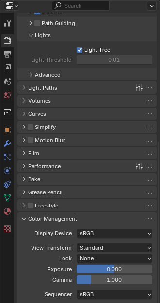
Render Output

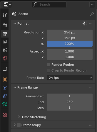
Based on wall textures in Half-Life being 128 pixels in height, my own choice of pixel density is 64 pixels per meter, so the texture file I want to have at the end should be 256 by 192 pixels. In the Output Properties, these go into the X and Y resolution of the render. Since the texture will be just a plain image, output file format .png will do, but you can of course also make it a .bmp or .jpg if that’s what you’re using for your games.

With these settings, the output file will already be scaled, cropped, and sized to the correct dimensions, which eliminates the need to do any of these things manually as you have to with a photo source.

Orthographic Camera

To get a good image of the model to use as a texture, we want to look at it straight on with minimal distortion from perspective. Conveniently, Blender provides us with exactly what we need.

I am making my models so that they are facing the direction of the Front Orthographic view that you go into by pressing 1 on the NumPad. So to have the camera that will take the final render of the model face on, I am setting its coordinates to X=0m and Y-10m, and to a Z-coordinate that is is on the center of my model. In case of this 3m high model, that’s Z=1.5m.

In the Object Data Properties of the camera, the Lens Type needs to be set from Perspective to Orthographic, which eliminates any distortions from perspective. To get the correct zoom on the camera, simply press 0 on the NumPad to see exactly what the camera is seeing right now. Set the Orthographic Scale to whatever value makes the edges of the camera view align with the area of the model you want to have in your final render. In this case, the zoom is 4.
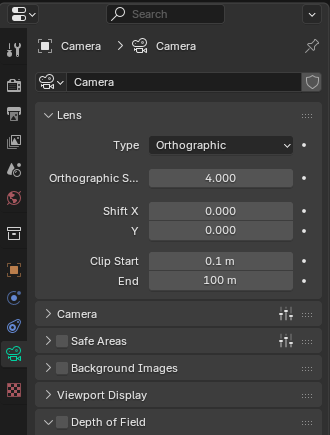
Lighting Setup

Getting believable looking shadows that sufficiently sell the illusion of depth is the whole purpose of this entire method, so here is where the actual magic happens.

Disable Other Light Sources

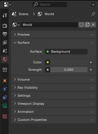
The first thing we want is to eliminate any interference from additional light sources in the scene. So delete any Light objects that are present in the scene, or just click on  the Disable in Renders icon in the Outliner.

Then go into the World Properties. By default, even when there are no light sources in the scene, there is still a faint grey light that provides some visibility when Viewport Shading is set to Render. This light source is called “Surface” here in the World settings. Set the Strength to 0 to turn it off.

To get uniform lighting on our model, the only light source we are going to use is a Sun, which can be put anywhere in the scene. This means any point on the model will get light coming from the same direction and at the same intensity, which you don’t get from Point, Spot, or Area lights.

Light Orientation

Since we are producing a simple color image as our texture with no normal map or anything like that which will produce shadows based on the direction of incoming light,  the shadows are going to be fixed, regardless of whatever light sources will illuminate them in a game level. Which means the shadows will almost always be incorrect in-game, and half the time even facing towards the nearest light sources instead of away from them. Shadows will also always look the same, whether the light comes from direct sunlight, an overcast sky, a flashlight, or a fire. Which in reality produce very different looking kinds of shadows. This is just something inherent to this approach to faking shadows and creating an illusion of depth that can’t be removed. But with the right lighting setup it can be made less noticeable and disrupting.

Most environmental light that we encounter anywhere in our world comes from above. But it almost never comes down to the ground at a perfect 90° right angle, and as the sun moves through the sky during the day, it starts and ends coming in perfectly horizontal. Artificial light usually comes from the center of the ceiling of a room, hitting some objects at a 0° angle and others at a 90° angle, and most somewhere in between. It’s extremely rare to have a dominant light from below. So to get shadows that look okay-ish in most light conditions, having the light come in at a 45° angle is clearly the best compromise.

But with a lot of things that are attached to or build into walls going from floor to ceiling, horizontal shadows are even more important to produce a perception of depth. It only takes a very shallow angle to create some shadows, but when objects protrude from the wall only a slight distance, like doorframes or picture frames, these shadows will be very narrow and easily disappear at the low image resolutions we are dealing with here. Having tested out various angles, what I have found is that again a 45° gets the best looking result. You could use a more shallow angle of 30° or 15°, which would draw less attention to the fact that half of all horizontal shadows are facing into the wrong direction. But if you do that, you will have to make adjustments to the light intensity, which I will get into later.

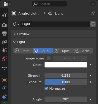
For my setup that I am using, I am setting the rotation on the light object to X=45° and Z=45°.

Light Color

Since we want the textures to appear in-game with the right colors based on the color and intensity of in-game light sources, the texture model has to be illuminated by pure white light. By default, the color of any new light in Blender is set to #FFFFFF, so nothing needs to be touched here. I wouldn’t touch color temperature, since everything we’re doing here is just raw data to be digitally processed later. And while 6500K color temperature has a point in some situations, this is not one of them.

Light Strength

The Strength of the Sun light is where things are getting a bit curious. If you’ve set the light to come in at the X=45° and Z=45° angle, the number you want to put here is 6.283. But the reason for this seemingly arbitrary value is somewhat interesting.

Blender Light Calculation Tangent

Yes, 6.283 is 2π. Apparently, the value you want for a light that comes straight down at a right angle is exactly π. I don’t know exactly how the math works, but I believe the way that Blender calculates how light spreads out through space is in a sphere emanating from a point source, which is how π comes into the equation. To have a surface rendered close to the same RGB values as its colors as specified in its texture file under perpendicular light, you have to set the Sun light strength to π (3.142).

But since our light does not hit the wall at a right angle, the same amount of light is spread out over a larger surface area of the model, and the light intensity on the surface goes down. For a simple 45° angle, the reduction in illumination and necessary increase in brightness to compensate would be √2. However, we have the light come in at both a 45° x-angle and 45° z-angle. Blender 4.5.9 calculates the dropoff by multiplying √2 by √2, which of course comes out as 2. And multiplying our initial Strength of π (3.142) by 2 gets us to the Strength setting of 6.283.

But this is actually wrong and a mistake by Blender. The correct way would be to first combine the two vectors from the two angles into a single angle and calculate the dropoff from that, which leads to the correct dropoff factor of 1.6329. It’s possible that this might get fixed in later Blender versions, in which case the light Strength needs to be set to π * 1.6329 = 5.131.

Light Exposure

However, I have found that even with the right amount of illumination from the light source, and the color management View Transform set to Standard, colors on flat surfaces in renders don’t match the RGB values specified in the object’s texture. Adjusting the Exposure in the light’s setting seems to help though. And with the color palette I am using to paint textures, I found the best result to be when setting Exposure to -0.08. Except for some shades of green, I can barely see any difference when comparing the original and rendered colors in GIMP.

Angular Diameter

Finally we have to set the angular diameter of our Sun light, which Blender incorrectly and confusingly calls Angle in the Object Data Properties. Measuring the actual size of objects in the sky is impossible if you don’t know their distance. But you can always measure how much how much area in the sky they cover up, which is its angular diameter. (Assuming a sphere or circle with uniform diameter.) Except for hypothetical true point sources of light, all real light sources are emitting light rays from many different points all over their surface. And light rays coming from different points on the light source’s surface are able to reach different points behind an illuminated objects, effectively making every point on the light source cast their own, slightly different shadows on surfaces behind the object. If the points from which light rays emanate are very close together, their shadows will line up with each other and we get very sharp edges on the combined total shadow. If the light rays come from points that are spaces out over a very large surface, then their individual shadows will be more spread out as well, resulting in very fuzzy edges on their combined shadow.

A light source with an angular diameter of 0° would produce perfectly sharp and crisp shadows. The Sun has an angular diameter of 0.5°, which is still pretty small, and as such shadows from direct sunlight are still very sharp as well. In contrast, on an overcast day, daylight comes from everywhere on the sky at seemingly the same intensity, making shadows so blurry that they have no visible edges at all. The entire sky is the inside surface of half a sphere, so its angular diameter is 180°. And that’s why 180° is the maximum angular diameter setting that Blender accepts.

Since we want the most generic shadows possible on our textures, so that they can look okay in almost all lighting conditions encountered in a game world, I think that again the middle ground between the two extremes works best, so I would set the angular diameter for the sun light to 90°.

And now all that’s left is to start rendering and it’s done.

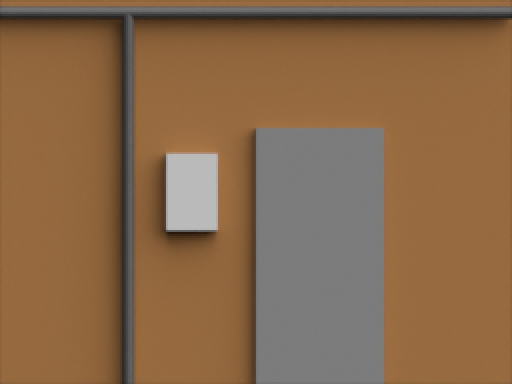
Scaled up to 200% size for better visibility in browsers.

With just the flat colors on the different surfaces, this still looks very flat and unappealing. But how to get the graininess of typical 90s textures is for a separate article.

Settings Summary

  • Render Properties: Color Management: View Transform to “Standard”.
  • Output Properties: Set X and Y resolution to desired output size.
  • Remove or disable other light sources in the scene.
  • World Properties: Surface: Strength to “0”.
  • Camera Object Data Properties: Lens type to “Orthographic”.
  • Add a Sun light to the scene.
    • Light Object Properties: Set Rotation X and Rotation Y to “45°”.
    • Light Object Data Properties: Keep color white (#FFFFFF).
    • Light Object Data Properties: Set Strength to “6.283”.
    • Light Object Data Properties: Set Exposure to “-0.08”.
    • Light Object Data Properties: Set Angle to “90°”.

Experiment with the angular diameter and the Y-rotation on the light (and adjust the strength up and down accordingly) to see what kinds of shadows you like best.

Sarhat Building

Creating these buildings was a four day marathon, but it was a big learning experience about developing fast processes for creating future game assets in Blender. The six buildings in this scene are all made from only 10 blocks using 3 texture files, and the application of a lot of Array, Boolean, and Mirror modifiers. With these blocks, I can now create buildings of any floor space dimensions with one to three stories, and place these windows, doors, gates, and internal staircases with a few clicks through drag and drop. These techniques will become invaluable when it later comes to creating whole palaces or underground bases as levels.

A small moment for Game Dev…

This is it. The real thing.

The first screenshot of Iridium Moons.

This is the roof of a tower with several floors and internal stairs that made in Blender, running in the Godot engine. And I climbed it from the door at the bottom all the way to the top. There are no textures, no interactivity, and the controls are absolutely horrible. But it runs. This is the very first build of Iridium Moons.

Getting here was a giant pain in the ass. But that was mostly the slow pace of the very tedious learning process. Now that I know how to make complex building shapes, doors, and stairs, and how to do UV unwrapping and creating trim sheets for textures, I am hopeful that things will be progressing very fast from here out.

Graphics Style References

Once I had decided that I would be making a game in first person 3D, I knew very soon that I wanted to make something in the Raw 3D look of the mid to late 90s like the Quake engine or the PlayStation. But now that I have started making character models and textures in Blender, I really had to made concrete decisions about how much geometry would be on characters and environment objects, what character faces should look like, and how many pixels a texture should have per one meter of surface.

(Humanoid limbs have seven segments. Hands are cubes without fingers. Cylinders have 12 faces. Faces are a static texture on flat geometry. And 128 pixels per meter.)

The first choice I had to make for a visual style is do I want something in the style of Quake or in the style of Unreal. Unreal also has a really pleasant visual style, but in the end it became clear that it really has to be Quake. While the game Quake itself does have a visual design style that isn’t really isn’t offering anything that would make for a useful reference for any assets in Iridium Moons, I really like the amount of fine grain detail on the textures that really pops out when texture filtering is disabled. And the pixel density on environment textures feels like just the right resolution for me. Quake also has a crisp sharpness to everything that PS1 games generally don’t have. I think it’s the lack of dithering, which I also won’t be using for Iridium Moons.

The other main game that stands out as one of the best looking Raw 3D games with fantastic looking unfiltered textures is Metal Gear Solid. But that game is designed to be seen from a quite high up top down perspective, and the models and textures designed for that in mind, which is quite different from a very close up first person view. So I am going for a higher pixel density on textures, somewhat more polygons on character models, and more small environment clutter objects on tables and shelves. I really like the approach to faces, which is flat heads with a texture that is so low resolution that you can’t actually make out any details on any features. I always hated drawing faces and having to deal with eyes and mouths, and Metal Gear Solid has a style that gets around that while still being consistent with the overall aesthetic. The use of color in this game is really nice, and I just love the use of lighting in the environments, which is something hope to be able to somewhat emulate. I am not going to simulate any kind of graphics artifacts caused by the PS1 hardware, because that’s just a silly gimmick.

A better example of great looking PS1 graphics that are closer to what you would see in first person view is the Syphon Filter series. I feel Syphon Filter makes for a great reference for modelling and texturing characters. I also quite like the character animations, which I think are a bit more smooth with less stiff body posture than in Metal Gear Solid, but still have some of the low-fidelity jitter going on. I also definitely want those transparent pixelated fire sprites for all my fire effects. While the level geometry and environmental decoration is extremely sparse in Syphon Filter, it’s use of darkness and colored light looks really cool to me.

A more recent game that uses a similar visual design but isn’t limited by 30 year old hardware is Peripeteia. As with Quake, the design aesthetic of Peripeteia is very different than what I am going for with Iridium Moons. But I really like how it uses modern computing power to make use of space and scale with its environment. Somewhat unreasonably sized buildings and natural features is something that I think will serve the overall tone of Iridium Moons quite well. I also like how the level geometry is not only big cubes arranged on a square grid but with much more pillars, pipes, and stairs and some environmental objects.

I am also very intrigued by the level of detail seen in the trailers for Compound Fracture, which might be the only thing we’ll ever get of the game. There is considerably more going on in the environment than in the PS1 games or Peripeteia and I think this might perhaps be the perfect level of texture detail, environmental objects, and lighting for me. It would significantly increase the work time on asset creation and I’m not even sure if I will be able to pull this of. But if I could get there one day, that would be really cool. Again, the tone and aesthetic here are completely different than the intended style of Iridium Moons.

Everything I said about Peripeteia and Compound Fracture goes double for Beta Decay. I love the graphics of this game. The level of detail here is probably too high for what I’ll be able to achieve. But having these graphics in bright sunset colors would be an absolute dream come true for me. And I’m absolutely going to combine PS1 style textures with real time dynamic lighting. With tiny texture files, tiny polygon counts, and probably a very limited use of shaders, I think it should still be able to run on a total potato of a computer.

Off our Scopes

Things have been going very well for the past weeks, with progress on developing my 3D modeling, texture painting, and rigging skills going much faster than I ever anticipated. I am planning to keep focusing on improving my texturing and animating skills, developing an art style, and putting together a basic assets library for the time being. But as things are going now, I think there’s a good chance I might actually start moving on to learning game programming in Godot before next year.

As part of figuring out an appropriate, consistent, and practical art style, I’ve also been thinking again about the overall approach to storytelling, NPC interactions, and gameplay mechanics over the last weekend. These do have some real consequences on how the game world will need be constructed and what kind of expressions NPC models will need to be capable of. Working out game mechanics and a general style of level geometry first and then creating assets according to the needs that arise would probably be the smarter approach in most situations. But with how much I’m putting on my plate with all of this, I feel that mastering Blender first before moving on to Godot instead of doing both in parallel will be a lot more sustainable for me. It could mean that I might have do redo a good amount of assets as gameplay changes during development. But having at least a solid plan now for how players are intended to move through the game world and interact with it should help with reducing the amount of asset work that will have to be redone.

While researching 3D games from the mid 90s and recent indie games with a similar Raw 3D look as references for an Iridium Moons art style, I became aware of Compound Fracture, a game greatly inspired by Dino Crisis. But other than two trailers that look very nice and impressive, there really is very little information on that game. And as it turns out, the first trailer came out almost 5 years ago now. Is it actually going to come out one day? Hard to say, but by now it seems quite unlikely.

This had me check up on some other 90s styles scifi action games I’ve been very impressed by some time ago. Beta Decay had it’s first gameplay trailer 3 years ago. Selaco over 5 years ago. And Peripeteia 6 years ago. Peripetia had a playable build on Steam 1 year ago, and Selaco 2 years ago. And none of these games have a release date yet. That at least one of these four games will be finished eventually is probably almost certain. That two of them will get a full release is quite possible. But three? That seems doubtful. And all four? I really don’t think so. Grainy low-fidelity sci-fi games that exist on the intersection between action, ImSims, and Survival Horror have been a very popular idea that get people very excited for many years now. And getting something that looks really good and fun in trailers seems to be fairly easy. But the track record for such games actually getting finished has been terrible so far. And these are all from people who have way more qualifications and resources than I’ll ever going to have.

Back in the 90s and early 2000s, it wasn’t uncommon for popular games to have their follow up being released only one year later. Thief II, FreeSpace 2, Fallout 2, and Knights of the Old Republic II, all come to mind. Though many people at the time thought that it would have been much better if the games had been given another half or full year of development instead of rushing them out like that, it was possible to create beloved classics like that by essentially being just new levels for the same game with no meaningful changes to the engine or gameplay. Game development for mainstream, big budget titles has gotten longer ever since because developers wanted to appeal to new customers who weren’t already hooked by the gameplay of older similar games or the story of earlier games in a series by impressing with more advanced graphics, more spectacular game mechanics and physics, and more size. Simply making another campaign for a game that already exists was not really a commercial option for them, and still isn’t.

But for small indie developers that are targeting the retro-style market, I think this is exactly what the target audience is looking for. A bit more polish, a bit less jank, and taking some lessons from interface and controls evolution would be greatly welcome. But I think a game that has game mechanics that are basically identical to standards from 30 years ago is absolutely viable. Maybe add two or three small innovations to give the game an individual personality, but I think we really don’t need to have 2020s games with low-fidelity graphics as purely an aesthetic gimmick. Every developer and team is free to give it a shot, but I know it definitely is not an option for me. I made the decision to go with a Raw 3D aesthetic for Iridium Moons entirely because this is one way I can make a game look visually appealing while keeping the technical skill required to an absolute minimum.

The overall framework I settled on last week is to aim for a game that could pass as an asst flipped, knockoff-Star Wars themed, total conversion mod of Deus Ex with the sneaking and visibility mechanic of Thief. That’s it. Nothing more.

Actually less even, as I think character customization for different playstyles is better done by selecting your equipment loadout instead of assigning upgrade points to different skills.

Since I am much more interested in stealth and investigation gameplay and environment design and not really into the idea of writing big stories and complex characters, I think it can also be made very episodic. Instead of structuring the overall story like a 2000 page novel series, I see Iridium Moons more like 2 hour adventure movies with their own beginning and end that take place in the same universe and revolve around the same protagonists. This should allow me to get at least something out the door that players can play after 4 or 5 years of development. And if I still have more in me, I perhaps could continue with another episode over the next 2 or 3 years, and keep doing that until I get tired of it. Which seems much more feasible to me than aiming straight for a complete 40 hour game in 10 different locations that gets canceled after 12 years of development with no end in sight.

Border Dimensions for fixed resolution UI and Pixel Art

One of the annoying things with many older games that have been updated to run on newer screen resolutions is that the static image UI often gets tiny and unreadable or doesn’t cover the entire screen as it’s supposed to.

Fallout can do both!

Playing on the original resolution with the rest of the screen being filled black is usually my preferred solution. But sometimes the game doesn’t want to stretch out to make as much use of the screen as it could and be absolutely tiny, which can become a serious pain in the ass to fix. Scaling very low resolution 2D images by factors that aren’t whole numbers can also cause issues as image pixels have to be stretched unevenly to reach both sides of the screen. And even when all of that works out, playing with black bars on the sides of the game is fine for playing 30 year old games, but when making low-fidelity games now, we really should make an effort to deal with different screen sizes and dimensions.

My planned solution to this for Iridium Moon is to design all the UI in 640×360 resolution and upscale it by whole numbers to keep it from shrinking on the screen or get distorted pixels. This will allow the game to look identical in 720p (1280×720), 1080p (1920×1080), 2560×1440, 4K (3840×2160), and even 8K (7680×4320). Which going by the Steam user statistics covers the primarily display setting of 78% of players.

But that still leaves 22% of players for who this won’t display properly. It’s certainly one option to create alternative UI versions with different base resolutions, or to make a split UI that will stick to the top or bottom of the screen with variable space between them in the middle. A 640×400 resolution UI will upscale without distortion to 1280×800, 1920×1200, and 2560×1600, which covers another 8% of players.

But the remaining 14% of players are spread out over a wide range of different aspect ratios, which each are being used only by few players. Making alternative UI versions to fit all these resolutions is not really practical, and they are going to have to accept playing with borders on the sides of their nonstandard sized screens. But they don’t have to be just black bars. There are mods for Knights of the Old Republic that extend the edges of menu screen to fill the entire screen.

KotOR Extended Menu Screen

But how much additional border do you need to fill out all screens when the main game UI has to remain a full number multiple of 640×360? Well, I’ve done the math, and it is this much.

Click to embiggen.

This image covers almost all the resolutions listed in the Steam user statistics and covers the screens of 96% of players. All of which fit into an additional border of 860×520 pixels.

Click to embiggen.

These three unusual resolutions are already very rare, being used by only 0.2%, 0.3%, and 0.5% of players on Steam, and so I wouldn’t worry too much about getting the outermost corners lavishly detailed. Very few people would ever see it.

For very detailed borders it could look a bit odd if some specific detail like a face or switch gets clipped by the screen edges. So it might be helpful to know where the clipping lines will be when placing such elements on the border. You can download the .xcf file for GIMP to use as a template when arranging the layout for such borders. The resolution shown in green, yellow, and light blue are not exactly the same aspect ratio, but the differences are mostly just a few pixels that would be very difficult to notice if they get clipped by the screen edges.