
Iridium Moons first started as an idea from the thought of “How would I redo Star Wars from scratch if it were up to me?” I’ve always only really been a fan of the movies and the Expanded Universe we had in the 90s, but even back then there was almost as much unfitting nonsense being added to its worlds as today. Which parts would I keep as they are? Which elements do I feel were missteps? And how do I think they could have been done better and more in line with what came before? Everything that the world of Iridium Moons has become over the last five years is really just elaboration on that original question.
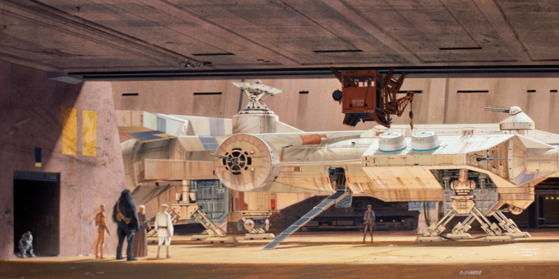
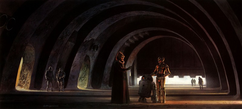
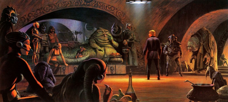
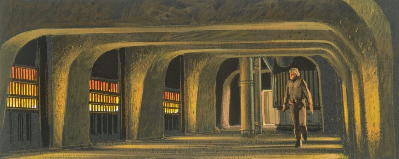
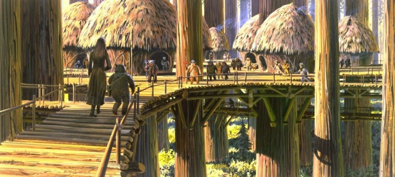
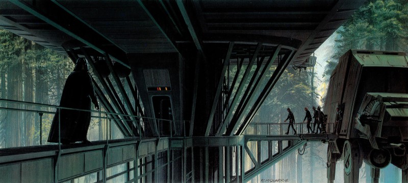
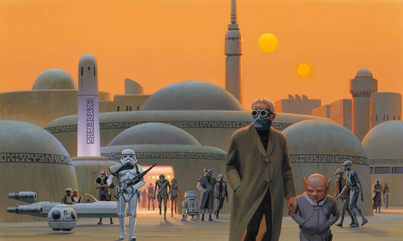
So the overall design style and aesthetic of Iridium Moons in my imagination was always extremely heavily based on The Empire Strikes Back and Return of the Jedi. The way that Yoda’s Swamp, Cloud City, Jabba’s Palace, the Ewok Village, and the Imperial Outpost on Endor appear in the films is already incredible, but I think their aesthetic essence come through even stronger in Ralph McQuarrie’s concept art that those sets were based on. Even paintings for sets that never made it into the movies feel to me more like capturing the essence of Star Wars that matters to me than much of the later movies. But I am also just a really big fan of how he uses light to really bring those places to life.
Two other artist who’ve been around just as long but who I’ve become really aware of only fairly recently are Greg and Tim Hildebrand. Who not coincidentally were hired to make movie posters for Star Wars 50 years ago, and who did produce concept art for Shadows of the Empire in the early 90s, because their sense of aesthetic is quite similar with that of Ralph McQuarrie.
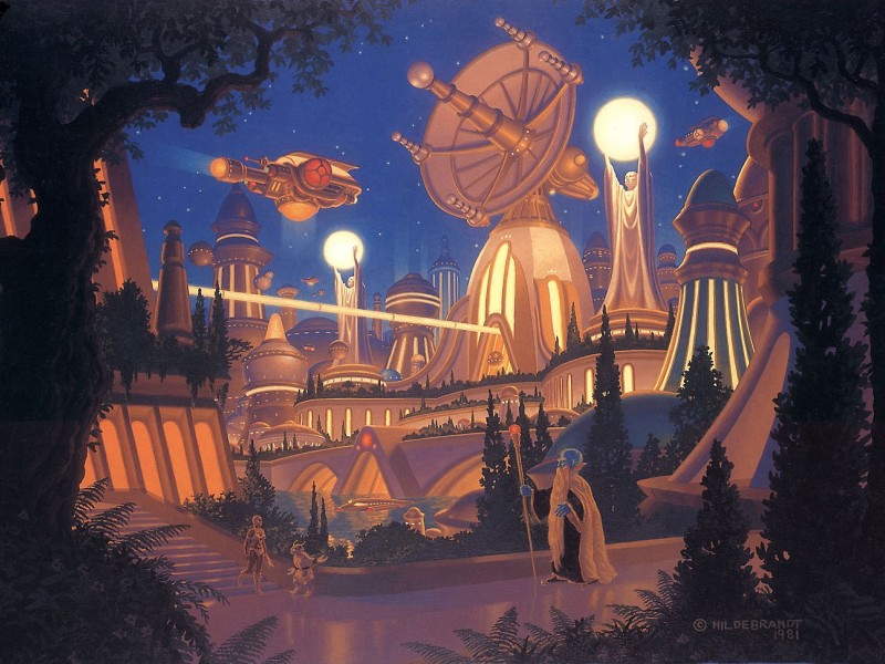
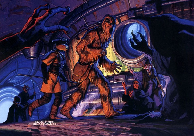
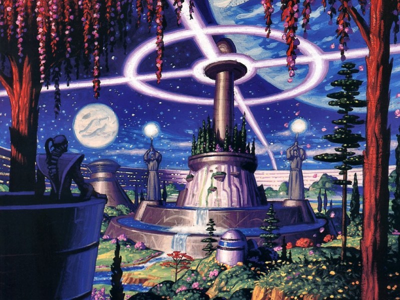
The first of these three I only found two weeks ago, and I think it’s become perhaps one of my favorite illustrations ever. Though I have no idea what that place or scene it’s showing is from. That third image from Shadows of the Empire might actually the the best and purest representation of the aesthetic sensibility of Iridium Moons that has been in my mind for some time now. The vibrant colors, the light and shadows, the stunning night sky, and the combination of retro-futuristic architecture with lush vegetation has everything I love.
I have had a fascination and infatuation with pine forests in the summer almost as long as I can imagine. It goes back to at least my first school trip to the Lüneburg Heath, a fairly big landscape between Hamburg, Hannover, and Braunschweig formed by the last two ice ages that is such barren, sandy soil that almost nothing grows there except for heather and pines. We did five half-day trips there over a week in first grade, and it’s been one of the most memorable experiences for me in my whole life. The light under the pines is something very special, and it probably also helped that the landscape can look a little bit like something from a dinosaur book from the 80s.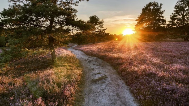
Seeing Return of the Jedi four years later and a big portion of it being set between and under those giant redwood trees cemented my fascination with these kinds of environment for all time. I also had some great vacations with my family in Southern Europe, where such pine forests are very common as well.
When I started resuming working with Blender last week and getting ready to make some first game environments, I had been thinking about what the general architectural elements are that make up the vague images for that have been floating in my mind for the last years. Particularly the Ralph McQuarrie designs of course, and then I had a sudden realization where else I’ve seen that general architectural aesthetic that I am envisioning as well. Ken Adam’s interior set designs for many of the James Bond movies.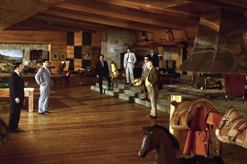
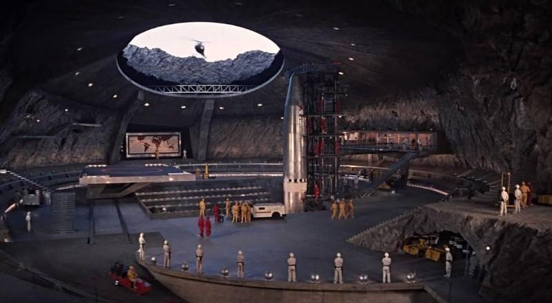
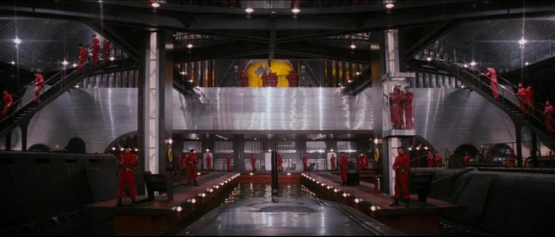
If you’ve seen the Bond movies from the 60s and 70s a couple of times, you instantly know what the Bond Villain Lair style is. Ken Adam designed about half of them, and the other half very strongly follows the style he established in Goldfinger and You Only Live Twice. He also did the sets for Doctor Strangelove, which I think won’t come as any kind of surprise to anyone familiar with these movies. And considering the timeline and that both worked in movie production design, I think there’s a good chance that Ralph McQuarrie took considerable inspirations from Ken Adam’s style. He’s probably my favorite architect.
Both Adam’s James Bond designs and McQuarrie’s Star Wars design share a lot of very prominent features. The first that came to my mind immediately are the rows of support beams for the ceiling that protrude from the walls rather than being hidden inside them as it is usually done. Walls, and sometimes ceilings as well, are often slightly angled inwards, creating the appearance of a vaulted ceiling. Which often appears relatively low compared to the width of the room they cover. Lighting is added to these spaces often indirect, with lamps shining at the walls and reflecting into the space from there, and often directed to mostly illuminate the floor and lower walls, leaving the ceilings often quite dark. I don’t know if they are were I got that from, but I’ve always been lighting my homes in very similar ways. It just feels so much more cozy, with a hint of rustic. Which is a great match for the overall low-tech retro-futurism of Iridium Moons.
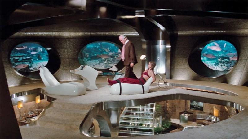
Ken Adam’s designs have clear influences from Brutalism, but his sets never had the appearance of actual raw concrete. It’s always either covered in warmer colored limestome or in the appearance of bare rock. Often with inexplicable fireplaces and fuzzy rugs, a lot of wood, and even lush plants. Which all helps with that hints of a rustic style in these hard stone environments. I think Brutalism is a very fascinating design style, but leaving the concrete completely bare always seems like too much and makes every space hostile and inhospitable. But add a bit of wood and some plants to it, and I think it can look really nice.
This is a very strong design aesthetic to use as a basis, but there’s also a couple of other things I want to add to that to give it my own personal touch.
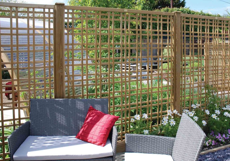
I think lattice screens of any kind make every space instantly way more interesting and comforting. I think I got this idea from many of the artwork in the RPG Coriolis, where it’s a common element of the overall aesthetic. They also create shadows similar to pines (and planes, also a very nice tree), which I guess adds to my attraction for them. Though I do have some concerns that such visual elements might not work too well with low-resolution, unfiltered textures that make the Raw 3D look of the PlayStation so memorable. Covering already jagged textures with jagged see-through overlays might result in an excessively noisy image, and so this might not work out with the intended graphics style I am aiming for. But that’s something that will have to be seen later.
Another cool design element that is all over Coriolis is having decorative trims on the edges of fabrics. Which is something that I later noticed was also used by Ralph McQuarries design for the architecture of Tatooine, to make the otherwise plain and single color buildings more visually interesting. But I think that didn’t make it into the movies. Still very cool design, and I want to put that all over buildings and clothing in Iridium Moons.
And finally, something that I found very memorable back when I played Dragon Age II, were the huge bright orange banners that decorated many of the pretty barren walls in Kirkwall.
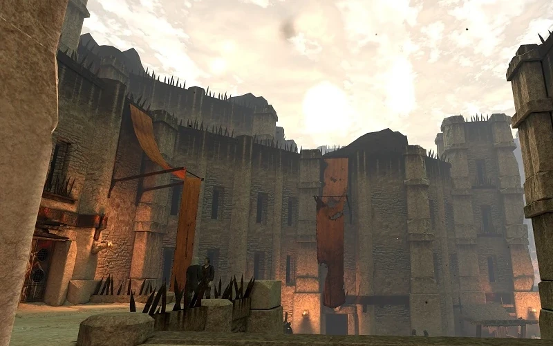 I think these really give a nice extra touch to bare sandstone walls, which I think will be in Iridium Moons a lot. And it’s such banners, flags, and awnings that are the sole reason I want to bother with any kind of physics in Iridium Moons at all. I think these will look even better when they are fluttering in the wind. And if there’s going to be cloth physics, might as well go all the way and have big capes and long scarves on characters as well. The golden sunlight and interesting shadows of pines are already cool, but they become even better with a persistent breeze from the sea. I lived close to the coast for most of my life, and practically all my vacations have been to the sea. And landscapes without wind are always only half as interesting at best.
So far, all of this still only exist as somewhat vague images in my head. But I think I have the component for something very strong and memorable, which I hope will give Iridium Moons a very specific look and aesthetic. Video game graphics style for a long time seem to have gone either for realistic drab or full out crayon cartoony. And especially in the Raw 3D style, nearly everything being done today is very dark brown and grey horror stuff. I think trying this with the Hildebrandt approach to color and light is going to be really fun.